Sunday 28 December 2014

Analysis of titles for High School and Youth dramas (Blogpost Task 12)


The order of title sequences of high school and youth drama:

      The differences in the order of title sequences:

Practical Remake Activity (Blogpost Task 16)


This evidence of editing of our remake of 'The Breakfast Club' remake:


Bend It Like Beckham- Youth Drama (Blogspot Task 15)

Bend it like Beckham


Camera
.Two shot
.Close Up
.Camera height same as the ball whilst dribbling.
.Tracking shots

Editing
.Edited body into football match clip
.There was a fast/quick edits whilst dribbling with the ball 

Mise-en-scene
.Football kits
.A stadium
.Traditional Asian clothing

Sound
Music (Asian)
.Crowd which is noisy
.Sports commentary

What are the sub-genres of Teen Drama films? (Blogpost Task 11)

Extension Activity- who makes title sequences? (Blogpost 9)

.
We often watch titles sequences, they engage us and entertain us. However, we never really take into consideration the hard work and imagination behind it. Here is an interview from Danny Yount who was the creator of The Iron Man 3 title sequence, so we can get a more in depth picture of what exactly goes into making a successful and memorable title sequence.

A discussion with Creative Director DANNY YOUNT.
This is your third Iron Man film. How has it been working on this series?
I guess I have a history of doing titles for Robert Downey, Jr. films — like Sherlock Holmes — and I always look forward to working with Kevin Feige and Victoria Alonso and the directors they choose. But this one was extra special for me in that I was able to work with Director Shane Black, whom I did titles for back in 2004 for a movie he wrote and directed called Kiss Kiss Bang Bang. It was one of the films Robert Downey, Jr. did right before he became an action hero.
How was it to be reunited with Director Shane Black after your previous collaboration on Kiss Kiss Bang Bang?
Wonderful! For me it was one of those full circle kind of experiences. I never met Shane until this film. When I did Kiss Kiss Bang Bang I would meet with Producer Joel Silver, who has a real appreciation for good design. As good as that experience was, I always wondered what it would be like to work with Shane. In person he seemed very down to earth. We started talking about the titles for Iron Man 3 one morning and the subject of Kiss Kiss Bang Bang came up. He was very complimentary of the work I did for it. And I was of him — I think he’s a great writer.
What are some differences in working with Directors Jon Favreau and Shane Black? 
Everyone has their own working style but both are equally gifted, in my opinion. One thing about Favreau is his ability to clearly articulate all the details. He has a very sophisticated perspective and is a great communicator, which was important with all the crazy work we did on the hologram interfaces in Iron Man 2. Plus, like Shane, he’s a very nice guy and good collaborator. Both of them are very secure in who they are as filmmakers which always makes everything easy.
“Striptease” concept by Kyle Cooper
Could you tell us about the original concepts for the title sequence and how they were developed?
The first presentation I did with Ilya Abulhanov was very rigid and technically ambitious, but Kevin and Shane wanted none of that! They were more open to ideas that were a little wacked out and fun, like one edit that Kyle Cooper made of Iron Man doing a striptease in his removable suit, haha. So that began a conversation with him and Kevin of what they wanted.
“Stark Legacy” concept styleframes
This concept explores the science behind the suit — handed down from Tony’’s father and perfected by Tony himself.
At the core of this design exploration are visuals representing a series of tests in what appears to be various interfaces and archival material shot macro. Within this framework there are 2 parallel streams- the science data collected by Tony’s father (used by Tony as reference) and the trials and triumphs of Tony’s own explorations. This visual compilation appears to occur over several periods of time- from early studies of stress tests and jet propulsion to nuclear fission and nanotechnology- to ultimately the holy grail of the blending of neuroscience and biologically responsive hardware.
Designed by Ilya Abulhanov and Danny Yount.
Where did you get the idea for the energetic split screens and angled transitions?
Shane is open to retro things — as evidenced in Kiss Kiss Bang Bang — so he wanted something kind of like an old film title… like Pablo Ferro’s Bullitt titles. And I’m a product of the ’70s and ’80s so I love old TV crime drama titles like The Dukes of Hazard and Get Smart. I’m also a huge fan of the classic comedies like Airplane! and The Naked Gun, which to me are all about taking a very serious subject and finding the right way to make it extremely unserious. So I made a test edit or animation of the titles using the Iron Man 1 and 2 show footage and stuff I found in the current trailers running.
“70’s TV” concept motion test (per request of the director)
I wanted the animation to be almost overpowering and ridiculous, so I went for the most clichéd move I could possibly think of.

Danny Yount
In the test I used the music from an old show called The Mod Squad, which was the cool show to watch back then. Now, the music is so campy that it’s hilarious. Everyone seemed delighted by the tone and the comedic moments found in unexpected freeze-frames. But the ’70s vibe was a little heavy-handed for them so we ended up somewhere in the ’90s, with drop-shadowed type and TV-like wipes and split screens. The color freezes are about the only ’70s aspect of the style but it seems to work well overall. One of the designers made an angled wipe which I liked a lot, so I wanted most of it to have that.
How was the order and selection of images decided upon? Did you know right away that you wanted certain recognizable images in the sequence? 
I pretty much just went through each film and found what I thought were the best scenes. We then categorized them into action scenes and lifestyle scenes. Then, we sub-categorized them editorially into match cut moments, like every time Tony Stark or Iron Man uses a certain trick or every explosion or every time you see beautiful women or cars. After all, it’s entertainment so it has to be pure fun
Was the music written before the sequence was started, or after you’d done your work?
No music was made until after the idea was accepted. And the audio that most editors chose did not at first have the same cool vibe as the Mod Squad music. The tone is all-important or it does not work. What’s great about the Mod Squad piece is the horns section — it’s almost monotonous which makes it funny. But the final piece scored by Brian Tyler seemed to work perfectly.
Why is “Iron Man Three” spelled out at the end?
Kevin saw it on the web somewhere being used as sort of a South Park-style visual pun and he liked it. I thought it was a fun choice. I love how open he is to things like that. I wanted the animation to be almost overpowering and ridiculous, so I went for the most clichéd move I could possibly think of: the mighty trailer-style camera track through type.
Without another creative outlet it is easy to become disillusioned in this business — you often give more than you get back. When you start taking it less seriously, it stays fresh.

Danny Yount
Would you have done anything differently?
I wanted the color to feel cheap but they wanted it to be film-accurate so we had to pull back on that. I also wanted more campiness and ’70s style tonally but that would have stepped on the film footage too much.
For the previous films Prologue has handled more than just the title design. Was it the same this time around?
Yes, we were asked to do some UI design — Tony Stark’s hologram phone and screens that use a database and track the President on Air Force One.
For the phone, there’s a scene when Tony kind of “flicks” the information above the practical base he is holding. His eyeline was a little high so I made a UI that unfolded information vertically above the device to reveal the Aldrich Killian’s dossier. I wanted the look of it to not be too far out in terms of product development from the established design of all the holograms we had created in 2, so I began with that and went from there. Ilya Abulhanov and team then animated the sequence.
Another team at Prologue animated 2 other graphic UI sequences designed by Nadio Tzuo — the screens in the news van while Tony was stuck in Tennesee, and the tracking screens that zero in on Air Force One.
Which tools did you use to put it all together and how big was your team?
The usual Adobe tools and GenArts Sapphire plug-ins. The 3D conversion was done in Autodesk Flame. The production team was six to eight people.
View 36 images
“Retrospective” concept styleframes
This concept was included in Prologue’s second round of presentations for the Main-on-End titles and it makes a distinct departure from their earlier more technical designs. Director Shane Black wanted more of a retro film title feel- screen wipes and split screens lend an overall 70s feel that really comes across the in the final Main-on-End title.
Designs by Monica Perez and Lisa Bolan
What did you enjoy most about working on this sequence?
That it was not an over-complicated or messy assignment! Good things happen when you feel like you can breathe creatively. It was also good to work with the same people again and see some familiar faces.
You recently left Prologue. What were your reasons for leaving the company at this stage in your career?
I’ve been at Prologue longer than any company I have ever worked at — more than eight years, which in this business is almost unheard of! I just needed a break from the routine and wanted to see what else is going on. I also wanted to be able to do other things like the Semi-Permanent titles, which I would not have been able to do otherwise. I don’t have any huge plans right now. I’m just going where good work leads me. So far I have had no shortage of work.
What kind of advice would you give someone starting out in title design specifically?
It’s hard work and long hours so be sure it’s something you are passionate about. Also, broaden your focus, because titles do not make a lot of money. You have to pay the bills with other kinds of work like VFX or commercials or broadcast design.
How would you feel about a possible Best Title Design category at the Oscars?
Part of me wishes that there was such a category. I think titles are an underappreciated art form that is essential to film. But the other side of me wonders if the politics that often drive things like getting an award would take the fun out of it.
What continues to excite you outside of the design world?
Travel. I love seeing how the rest of the world lives — it really influences design and gives me perspective. My first big experience like that was the time I was sent to Prague for nine days to shoot a commercial. It totally blew my mind to see the real thing — Prague was the center of Europe in the old world — instead of some cheap replication or picture in an art history book. Also, my family. If things are not good at home, they will not be good at work. My two sons Kyle and Jacob never cease to amaze me and my wife Vicki has the patience of a true saint. Any spouse in the motion business knows what I’m talking about!
I also play guitar on weekends occasionally with some pro musicians. That inspires me a lot and helps me to grow. Without another creative outlet it is easy to become disillusioned in this business — you often give more than you get back. When you start taking it less seriously, it stays fresh

10 Thing I Hate About You (Blogpost Task 7)


My favourite film is '10 Things I Hate About You' . The title sequence is very engaging and creative.The beginning introduces the institution of the film through the large blue text at the centre down the bottom of the shot. The large size of the text suggests the importance of the institution and the contribution they had to the film. This text appears from the right of the screen from a blue thick line which then appears as a blue circle left of the text and it is stationary once centre of the screen. It then lights up gold creating the text to stand out to the audience even more, presenting its importance once again. The same production company is presented once again however in the same text of the cast and crew which will soon follow. This ties the film in with the institution to present that they were the main production of the film. This time the text is right in the centre of the screen, standing out in a bright green colour. This text is animated and moving around fast as if it is sketched into the shot, creating a fun and upbeat feeling. Overall the title sequence gives the genre of movie which is teen, and it sets its purpose which is setting the mood of the movie.

4 types of film openings (Blogpost Task 6)


Friday 26 December 2014

Extension Activity- what is the purpose of a film opening? (Blogpost Task 5)

1) Thomas Sutcliffe says 'Films need to seduce their audience into long term commitment. While there is many types of seduction, the temptation to go for instant arousal is irresistible'  means that a films purpose is to primarily aim is to entertain its audience but nevertheless it also needs to engage
them.

2) Director Jean Jacques says that "the risks of instant arousal might give all the excitement at the beginning and has nothing to compare it with". In other words, the initial interest will fade and the audience will no longer would want to watch the rest of the movie.


3) "A good beginning must make the audience feel that it doesn’t know nearly enough yet, and at the same time make sure that it doesn’t know too little". This means that the role of the beginning of movie is to capture the attention of audience but not give too much of the movie away.

4) Stanley Kauffman classic opening would be that the opening should be some fort of establishing shot of the surrounding. This will typically show the building it takes place in and then the window in the building, which leads to the action within the room. This works as it allows the audience to know where the scene is going and what the environment is.

5) Kyle Coopers title sequence for the film seven is so engaging as the letters move on the screen as though they are trapped and are trying to escape, by the using the camera technique, close ups.The music is chilling and creates a scary atmosphere. From the opening we get the impression that the characters are going to have some sort of mental illnesses due to the use of cut up paper, creating a psychological horror theme.

6) It could be said Orson Welles wanted to achieve suspense in the beginning of A Touch of Evil by the use of explosions .This is effective as the audience are not expecting. Welles did this with the scene of a normal day and then suddenly a car exploding but Universal Studios put title credits over the opening, which ruined the effects. They did this, as they wanted to be recognized and known.


7)A favorite trick of film noir is using the title sequence as a flashback to the events that are going to occur within the movie. The rest of movie is going explain how these events occur making the viewer want to view more. However, if the audience already know what's going to happen it is very hard to keep the audience still interested as the main plot of the movie has been revealed.


Prelim film made in September (Blogpost Task 2)


In September I made a swede of a scene from the hit comedy teen movie '21 Jumpstreet' in which I learned how to edit my filming, use photoshop to create posters for advertising purposes and how to market my movie through social media. The link to this swede is: https://www.youtube.com/watch?v=hdSAOS0NRcc

Wednesday 24 December 2014

What is genre and what is Teen Drama?

Genre

In film, genre refers to the method based on similarities in the story and themes used in creating the film . Most theories of film genre are borrowed from literary genre criticism. 

Teen Drama

teen drama is a film and series genre which focuses mainly on teenage characters.

Examples of Teen Drama


  • 10 Things I hate About You
  • Youngers
  • 90210
  • Boy Meets WOrld


Sunday 21 December 2014

Analyse 2 Title Sequences


Analyse 2 Title Sequences from artofthetitle.com


Boardwalk Empire (http://www.artofthetitle.com/title/boardwalk-empire/)


Order of Title:
Cast
Casting By Meredith Tucker
Production Designer Bob Shaw
Edited by Kate Sanford
Director of Photography Jonathan Freeman
Co-Producer Steve Turner, Joseph Iberti
Producer Rudd Simmons, Rick Yorn
Supervising Producer Margaret Nagle, Howard Korder
Co-Executive Producer Lawrence Konner, Eugene Kelly
Executive PRoducer Tim Van Patten, Stephen Levinson, Mark Wahlberg, Martin Scorsese, Terrence Winter
Programme Title

The text is in block writing over moving scenes in the background.


Reservoir Dogs (http://www.artofthetitle.com/title/reservoir-dogs/)


Order of Title:
A film by Quentin Tarantino
Cast
Movie Title
Casting Ronnie Yeskel
Music Supervisor Karyn Rachtman
Costume Designer Betsy Heimann
Editor Sally Menke
Production Designer David Wasco
Director of Photography Andrzej Sekula
Co-Producer Harvey Keitel
Executive Producers Richard N. Gladstein, Ronna B. Wallace & Monte Hellman
Produced by Lawrence Bender

The text is over a black screen in gold writing.


Thursday 18 December 2014

The Breakfast Club Remake (Blogpost Task 17)


We have a group have decided to the movie 'The Breakfast Club' to remake.


Overall our remake of the title sequence, The Breakfast Club was quite successful. we managed to include the key scenes from the title sequence and we tried to replicate the sound to make it as accurate as possible. we changed the order of the title sequence to something that we thought was more conventinal as a group.

Monday 15 December 2014

Blog post 3


Title sequences are what we see at the beginning of a film, they were originally created to show who created the film but as time has progressed, they have been used in more innovative ways. not long after title sequences were created, cast members were added into the sequences and then more people involved in the creation of title sequences such as music, editing etc.


Eventually, it has come to the point where title sequences are now very important as they set the scene to the film, they inform us of main characters and what genre the movie is e.g. an animated title sequence tells us that the film could involve children.

Blog post 2


4. PRELIM Ogo Esther Joel Jonathan from 283goswell on Vimeo.
3. PRELIM Tyrique Fatma Souhila Jordan from 283goswell on Vimeo.

Thursday 11 December 2014

Analysis of Opening - Boyz N The Hood

Camera:

Crane Shot
Over the shoulder shot
Zoom from over the shoulder to close up
Roaming camera


Editing:
Blank screen with writing on it- facts about African American killings

This can be an indication to events that may occur later in the film


Mise En Scene:
Los Angeles
Crime Scene
Police tape

Sound:
Police Sirens
Helicopter sounds

Monday 8 December 2014

timeline

https://www.timetoast.com/timelines/inbetweeners

<object width="550" height="400"><param name="movie" value="http://www.timetoast.com/flash/TimelineViewer.swf?passedTimelines=975234" /><param name="passedTimelines" value="975234" /><param name="allowScriptAccess" value="always"><embed src="http://www.timetoast.com/flash/TimelineViewer.swf?passedTimelines=975234" type="application/x-shockwave-flash" passedTimelines="975234" width="550" height="400" allowScriptAccess="always" /></object>

Blog Post 11

https://www.timetoast.com/timelines/juno-3801bd5f-83c9-4871-8ccf-94f7f21ad541


Sunday 7 December 2014

Art of the title: Doctor Series 8 (2014) (Blogpost Task 4)

Doctor Series 8 (2014)


1)Which credits do we see & the order we see them in?
Doctor Who: Series 8


As seen in the screenshot above, the order the credits are seen is:
.The main two Actors/Actresses names
.The name of the series 'Doctor Who' with just below the production company which is the 'BBC'

2)What font type is used for the titles?

The type of font that is used is silverish shiny 'Cambria' or 'Times Roman' font in bold. This adds to the extraterrestrial feel to the series.

3)How we see the font- where do we see it in the frame?

We the font in the middle of the frame, this is effective as it immediately tells the audiences who is going to be in the show. In each frame the font is changed by the editing technique of transition in which when one actor/actress name is introduced, the font dissolves and replaces it self with another.


4)What happens behind the font- what do we see, who are we introduced to, what sound do we hear?

Behind the font the is "wibbly-wobbly, timey-wimey stuff that has made the long-running science fiction series so compelling for more than five decades". The time machine sets the genre of science fiction and a time tunnel motif. There is a non-diegetic of the infamous Doctor Who soundtrack which is up-tempo.
 

5)What do you like about this sequence, why did you pick it?

I like that the sequence is fast,simplistic and gets straight to the point.Many other titles take time introducing actors/actresses,producers.

6)What did other people think of it?

Many people such as the BBC were 'impressed' by the work of Leeds-based motion designer and Whovian Billy Hanshaw.


Art of the title- The Conjuring (Blogpost Task 4)

The Conjuring (2013)


1)Which credits do we see & the order we see them?

The Conjuring

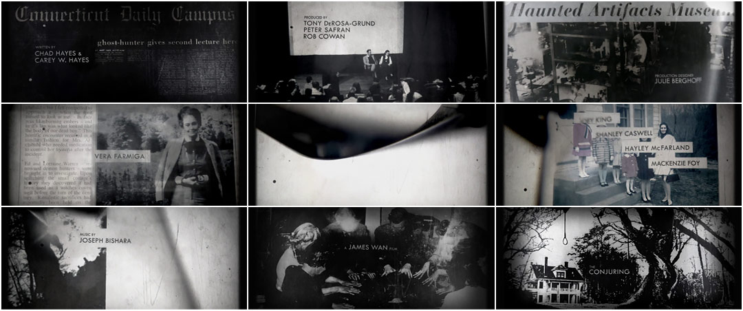
As shown in the screenshots, the order the credits are shown in are:
.Who the movie was written by
.The producer
.The production designer
.Actors and Actresses
.Who had done the music
.The director  'A James Wan' film
.The title of the movie 'The Conjuring'


2) What font type is used for the titles?

I'm guessing the font it 'Cambria' or 'Times Roman' because it very sophisticated and it adds to the seriousness to the movie. It also emphasizes to the viewer the genre the movie is going to be, which is blatantly horror.

3)How we see the font- what do we see, who are we introduced to, what sound do we hear?

The font is positions in the middle of the screen. This is effective as it diverts are attention to read the title and to see if we may recognise any of them.

4)What do we see behind the font-what do we see, who are we introduced to, what sound do we hear?

In the background there is old black and white newspaper articles, photographs of people and photographs of trees, this gives a haunted vibe.There is an eerie sound motif that is used to emphasize the theme of horror. The sound and the pictures are moving at a slow place deliberately to create the mood.It doesn't feel rushed, and it's something you see less of nowadays. The slower tempo makes it feel much older.Also a sound bridge is used to connect the title sequence to the beginning of the first scene, from a eerie sound to more of a calm non-diegetic sound.

5)What do you like about this sequence, why did we you pick it?

This sequence was interesting as gave suspense atmosphere making me want to go and watch the rest of the movie.The titles sets the mood and atmosphere for the rest of the movie. I picked it because as well as being interesting, I am a huge fan of horror movies and I have previously watching this movie, so I knew the titles would be intriguing to analyse it.

6) What did others think about the title sequence?

In a discussion with Creative Director Aaron Becker, of Becker Design this is what he had said:


"What were some of your inspirations and reference for the look and feel?"

"Early on, we were certainly looking at the photographic compositions and archival approach used in the titles for The Game, which has an eerie, genuine quality. Although this had some influence, the inspiration truly grew out of the library of imagery and the fact that the film is a ’70s period piece. In our minds, the success of the sequence was down to our ability to create beautiful compositions and use technology consistent with the time period."

Thursday 4 December 2014

Audience profile of 'American Pie' (Blogpost Task 10)

Target audience is
A particular group at which a product such as a film or advertisement is aimed. The movie I have chosen target audience I have chosen to analyse is 'American Pie'. Its target audience could be said is teens.Teen films is a film genre targeted at teenagers and young adults in which the plot is based upon the special interests of teenagers, such as coming of age, first love, rebellion, conflict with parents, teen angst or alienation. However, according to a website that stereotypes the typical audience viewer of 'American Pie' is:


Blog task 8


Blog post 10


Monday 1 December 2014

Title Sequences. (Blogpost Task 3)

Title sequences are very important when making a film as it has been proven that it is essential for the producers to establish the company credits, the actors that have played in the film and the staff that were involved in the making of it. Having a title sequence is to catch the viewers attention so that they can be interested to keep watching the film.


Introduction. (Blogpost Task 1)

Welcome to group 4. Our names are Souhila Boutiche, Jordan Campbell, Iman Jama and Jonathan Imiere
. We hope you will like our blogs and enjoy reading them.