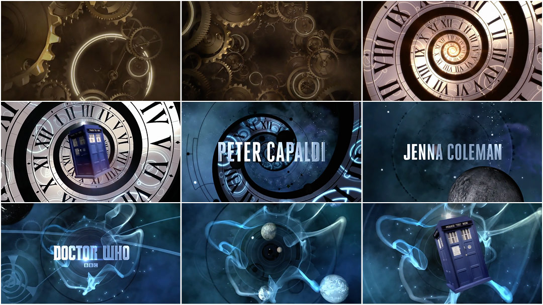
Doctor Series 8 (2014)

1)Which credits do we see & the order we see them in?

As seen in the screenshot above, the order the credits are seen is:
.The main two Actors/Actresses names
.The name of the series 'Doctor Who' with just below the production company which is the 'BBC'
2)What font type is used for the titles?
The type of font that is used is silverish shiny 'Cambria' or 'Times Roman' font in bold. This adds to the extraterrestrial feel to the series.
3)How we see the font- where do we see it in the frame?
We the font in the middle of the frame, this is effective as it immediately tells the audiences who is going to be in the show. In each frame the font is changed by the editing technique of transition in which when one actor/actress name is introduced, the font dissolves and replaces it self with another.
4)What happens behind the font- what do we see, who are we introduced to, what sound do we hear?
Behind the font the is "wibbly-wobbly, timey-wimey stuff that has made the long-running science fiction series so compelling for more than five decades". The time machine sets the genre of science fiction and a time tunnel motif. There is a non-diegetic of the infamous Doctor Who soundtrack which is up-tempo.
5)What do you like about this sequence, why did you pick it?
I like that the sequence is fast,simplistic and gets straight to the point.Many other titles take time introducing actors/actresses,producers.
6)What did other people think of it?
Many people such as the BBC were 'impressed' by the work of Leeds-based motion designer and Whovian Billy Hanshaw.
No comments:
Post a Comment