The Conjuring (2013)

1)Which credits do we see & the order we see them?

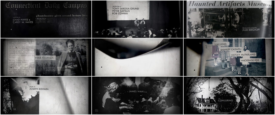
As shown in the screenshots, the order the credits are shown in are:
.Who the movie was written by
.The producer
.The production designer
.Actors and Actresses
.Who had done the music
.The director 'A James Wan' film
.The title of the movie 'The Conjuring'
2) What font type is used for the titles?
I'm guessing the font it 'Cambria' or 'Times Roman' because it very sophisticated and it adds to the seriousness to the movie. It also emphasizes to the viewer the genre the movie is going to be, which is blatantly horror.
3)How we see the font- what do we see, who are we introduced to, what sound do we hear?
The font is positions in the middle of the screen. This is effective as it diverts are attention to read the title and to see if we may recognise any of them.
4)What do we see behind the font-what do we see, who are we introduced to, what sound do we hear?
In the background there is old black and white newspaper articles, photographs of people and photographs of trees, this gives a haunted vibe.There is an eerie sound motif that is used to emphasize the theme of horror. The sound and the pictures are moving at a slow place deliberately to create the mood.It doesn't feel rushed, and it's something you see less of nowadays. The slower tempo makes it feel much older.Also a sound bridge is used to connect the title sequence to the beginning of the first scene, from a eerie sound to more of a calm non-diegetic sound.
5)What do you like about this sequence, why did we you pick it?
This sequence was interesting as gave suspense atmosphere making me want to go and watch the rest of the movie.The titles sets the mood and atmosphere for the rest of the movie. I picked it because as well as being interesting, I am a huge fan of horror movies and I have previously watching this movie, so I knew the titles would be intriguing to analyse it.
6) What did others think about the title sequence?
In a discussion with Creative Director Aaron Becker, of Becker Design this is what he had said:
"What were some of your inspirations and reference for the look and feel?"
"Early on, we were certainly looking at the photographic compositions and archival approach used in the titles for The Game, which has an eerie, genuine quality. Although this had some influence, the inspiration truly grew out of the library of imagery and the fact that the film is a ’70s period piece. In our minds, the success of the sequence was down to our ability to create beautiful compositions and use technology consistent with the time period."
No comments:
Post a Comment